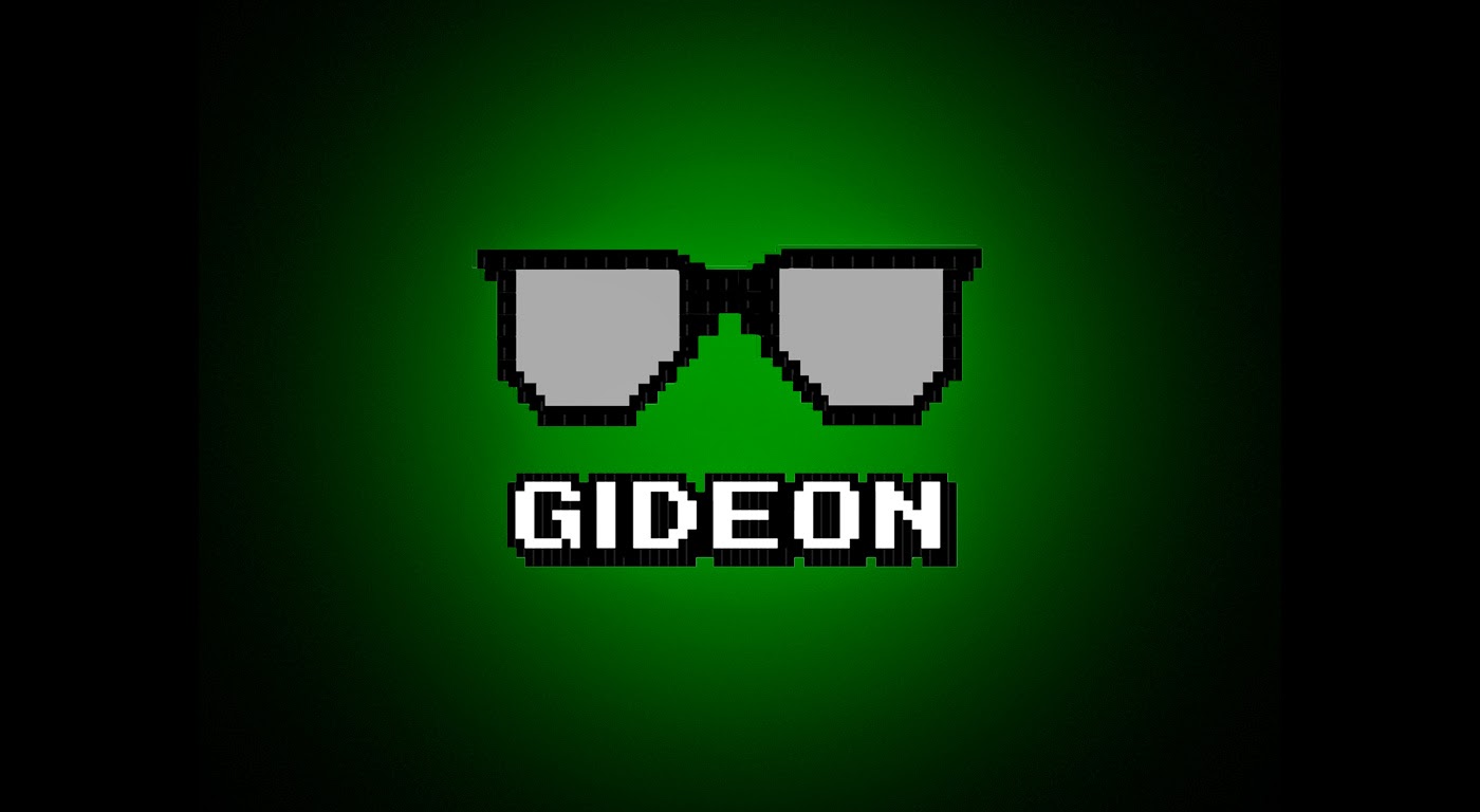
Below are the three versions of our final logo design used for our record company, Gideon Records, each used for individual things in our coursework.
The first one shown is the smaller of the three, as its primary use is as a watermark, this makes it easier to be placed things such as photos of the band and important documents (such as call sheets and the treatment).
The second one shown is the larger version of the logo. This version will most likely be the one used in our music video and will feature special effects to make the writing appear on screen at a different time to the glasses.
The final version features the original logo but with a black background. The green rectangle is replaced with a faded green circle. This highlights the the main logo and gives the white writing more character.

No comments:
Post a Comment